Rebranding of application in 3 months
YoContribuyo 2.0 (Holos) is a role-based access control SaaS used for continuous improvement in mining camps. It enables workers to organize into teams and propose improvements, scaling them through to successful resolution or rejection.
I worked as a UX/UI team of one, redesigning multiple concepts for version 2.0 of the app, which I presented to the client on a monthly basis. I designed it end to end, creating a new information architecture, delivering the final UI designs, validating them on a weekly basis, and working alongside the development team to implement them. I later took on a second role on the same project, joining the front-end team as a UI developer to code the designs myself and close the gap between design and development directly.
Worked directly with: 1 Project Manager, 1 Frontend Developer, 1 Backend Developer, and 1 Full-stack Developer.
5
User interviews
Conducted over Google Meet to eliminate assumptions and align business requirements with real user needs
2
Personas
Office staff managing processes vs. field workers starting tasks on-site
3 months
Timeline
Full v2.0 redesign delivered through monthly client checkpoints
The company had built its processes mainly around back-end solutions with poor UX, UI, and front-end work. This gave me the challenge to introduce a change of paradigms in the planning, research, and design models within the company, which I introduced successfully throughout the months.
A walkthrough from the messy, inconsistent v1.0 screens to the validated v2.0 UI, moving through low-fidelity, mid-fidelity (three rounds), and high-fidelity passes.
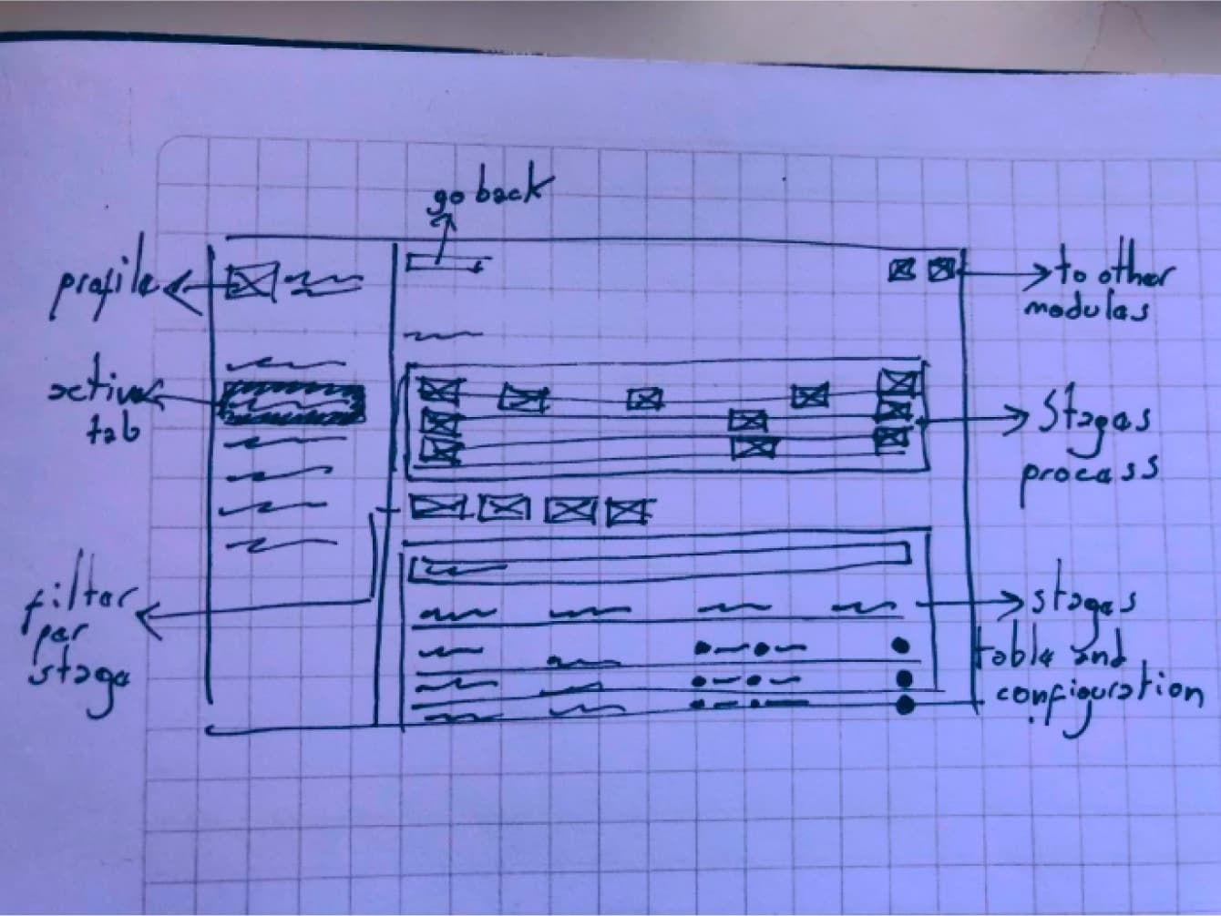
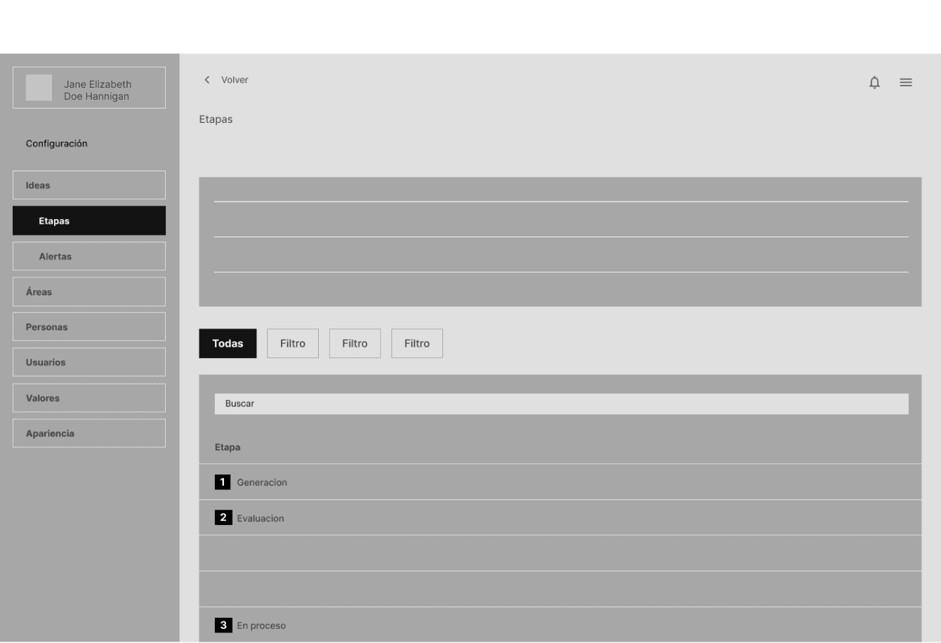
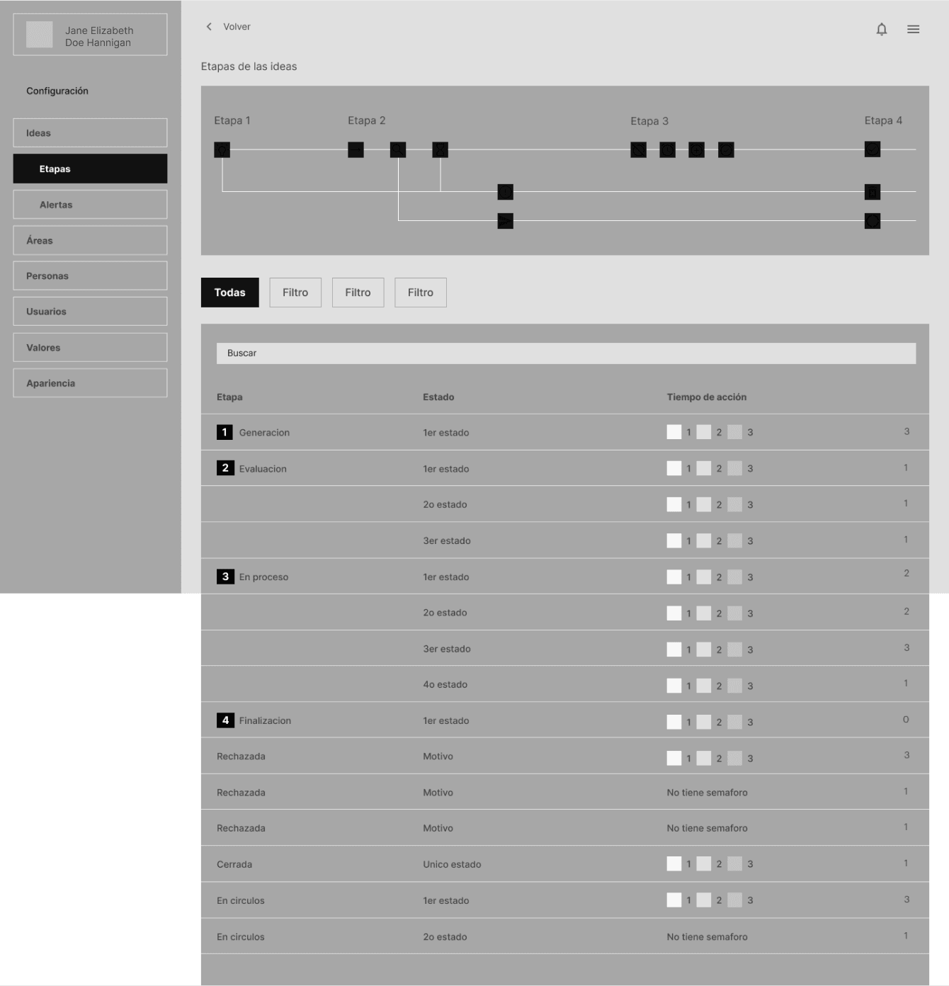
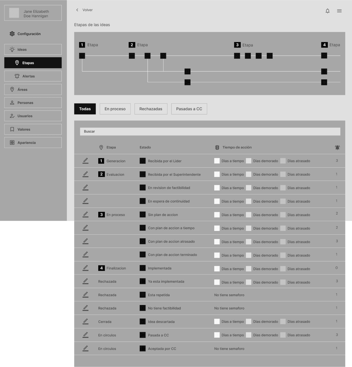
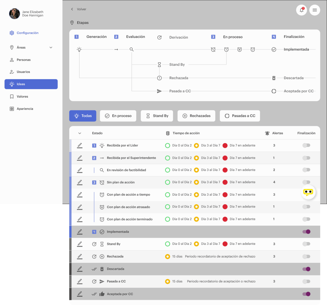
The project manager approached me with the need to design version 2.0 of a mining-camp continuous-improvement SaaS. Initially the team was in a rush to ship a QR-code module letting field workers scan codes to view tasks created in the app. My first focus was understanding the platform, its context, and who was using it, while keeping an agile approach and shipping on time. In parallel, we built the roadmap of deliverables needed for client approval. I conducted interviews over Google Meet with 5 users to eliminate assumptions and align business requirements with real user needs, using direct focused observation to learn user vocabulary, behaviors, and frustrations. This surfaced two personas: office staff managing processes started in the field, and field workers who detected issues and started tasks but had no way to track them on-site (the gap the new QR module would close). The existing information architecture was messy, so I mapped a sitemap and customer journey maps to restructure it around how people actually used the app. Alongside this I ran regular cross-team meetings with the development team to align on technology choices and close the gap between design and development. Once the redesign direction was validated, I joined the front-end team directly as a UI developer, coding pixel-perfect HTML, CSS, Sass, JavaScript, and React components straight from the design system and handing them off through Git and GitHub pull requests, closing the loop between design and shipped code myself.
The redesign aimed to help mining-camp teams get more out of an app that was underused and overcomplicated, cutting redundant work that could already be handled with data already in the system, and building a proper design system (typography, color, iconography, components) on top of a UI that previously had none.
The application was rebranded and redesigned within 3 months, replacing a confusing, duplicated information architecture with one validated against real office- and field-worker research and delivered through monthly client checkpoints.
Monthly presentations and weekly validation cycles kept the client aligned with the direction throughout the engagement, allowing the v2.0 redesign to be approved incrementally rather than as one large, risky reveal at the end.
This project pushed me to introduce a change of paradigm in how a back-end-first company approached planning, research, and design, all while shipping on an agile, client-facing cadence. It reinforced how much a validated information architecture and a real design system change the trajectory of a product that had grown without either.
 Mayorga